
I had so much fun putting together this fun little post about the ways I like red in a wedding, I thought I'd start to work my way through other colours. Starting with blue.... again not one of my favourite colours in it's true bluest form. I love a smoky duckegg blue, or a teal blue, or a navy but it's just not my go to colour. For the purposes of this exercise I've steered clear of a more teal blue and just stuck to a regular shade (if there is such a thing). There's two more to come but I'm saving them for next week!
If you want to see how I like red click here.
Blue with wisteria. So utterly pretty and feminine. Perfect for a kitchen tea or shower. Bring in Navy and Plum to give it depth, use lots of vintage china, toile fabric, lush garden roses and you're onto a sure thing. Invitation: Etoile.

Blue with a sunshiny, lemony yellow. An instant mood lifter. I definitely see this being used for a more casual outdoor wedding, lots of fresh fruit, picnic boxes, seersucker suits, vibrant modern design touches. Or a nautical theme... these colours lend themselves perfectly for that. Invitation: Arboretum.

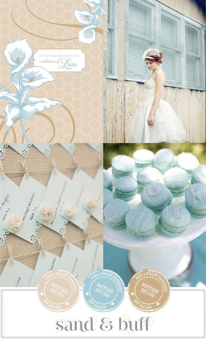
Blue with warm sandy tones. Truly delectable!! I feel peaceful just looking at it. Suited for a classic, refined soiree. Elegant, but with room to inject some vintage touches. It lends a very soft, dreamy appeal. Could also be used for a informal beach wedding. Invitation: Amour.

love all three sets! your stationary is lovely!!
ReplyDeleteYour sense of color floors me every time! Such beautiful combinations.
ReplyDeleteI adore your inspiration boards and color palettes - such a good eye for it!
ReplyDeleteOh Kate,it's hard to choose a fave but the Sand & Buff it gorgeous!!
ReplyDeleteIf it was possible to eat a digital image.... I would have devoured all of these!
ReplyDeleteI am definitely in the same boat as you. True blue is shocking, but its muted siblings can be divine!
These are such pretty color combos, and I love the way you put them together! :)
ReplyDelete