
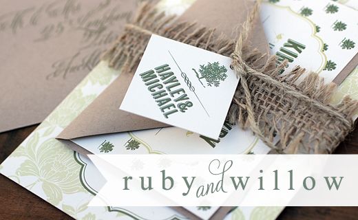
Some of you may have seen this over on The Knotty Bride from a few weeks ago... and if you head over there you'll find a free printable save-the-date invite in this design... one of the new one's that will be on our new shiny website if I ever get it off the ground!!! Are you partial to a particular colour way in this? At first I was all about the orange & pink version, but now the teal & chartreuse is a clear winner for me :-).


10 comments:
they are great!!
Kate - These are gorgeous!! Your invitations are incredible! I love the aqua and green! Your photography is phenom! LOVE
I guess I'll repeat myself ...This is GORGEOUS! I'm loving the color combinations & the citrus motifs are perfect for spring/summer
This is gorgeous especially the aqua and chartreuse!It is really perfect and my favorite.
your work is absolutely beautiful, kate. i love the colors!
These are gorgeous too! I loved the ones on the Knotty Bride, but love this color combination too! So very fabulous my dear!!!
xoxo
kristi
Oh I love the aqua and green combo - it's so beautiful.
Swoon-you know I love this suite! I couldn't possibly pick a favorite color combination, though!
Stunningly pretty, I always love the way that you style your stationery shoots. Really fresh and clean feel xxx
Oooooh! I love the citrus-y colors! Very summery!
Post a Comment