
A continuation from my post on Friday with ways I like to see blue incorporated into a wedding. And a bit of housekeeping re the new blog... if you want to see all the inspiration boards in the one place, you can just click that little image over there on the right and you'll have all the boards at once! And don't forget you can also click through the gallery on our Facebook page, or see them all as thumbnails which is a great way to pick and choose.
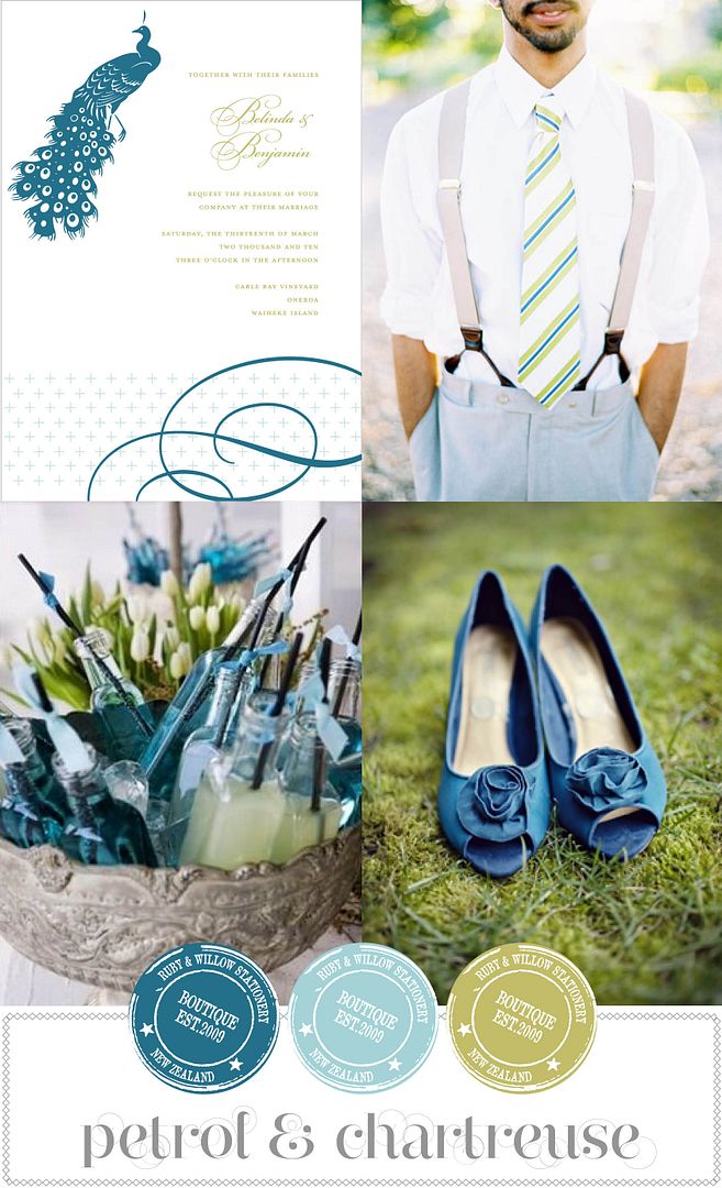
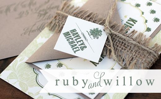
Blue with Chartreuse green. This has always, always been one of my favourite colour combinations - in fact one of the earliest rounds of my logo was in these colours. It's so crisp and fresh, and perfect for a wedding where you don't necessarily want to be overly pretty and girly (or if you have a certain someone giving you the thumbs down about pink!). Invitation: Plume
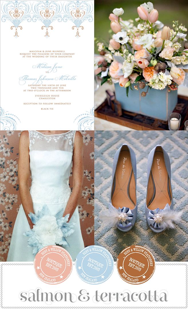
Blue with Terracotta. This colour combination isn't one you see a lot, but it's ever so pretty. Add in a softer salmon or dusky pink and it's a sure fire winner. Perfect for either garden wedding or ballroom soiree.


7 comments:
lovely the salmon & terracotta is my favorite combination!
Super congrats on the site revamp looks awesome!!
LOOOOOOOOOOOOOVE your new site, babe! Gorgeousness!!!!!
STUNNING! We are in love with the new look, Kate!
The new look keeps looking better every day! And it looked damn good to begin with so thats really saying something. G x
Hi Kate, Love the new look!! love the colours, always something to look forward to each morning, to see what you have posted!!
Really starting to love blue in ways that I never imagined...I guess I'm cheating on pink...oh well it will get over it..I'm fickle...
That floral arrangement is to die for!!!!!!!!!!!!!!!!!!!!!!!!!!!!!!!!
Post a Comment