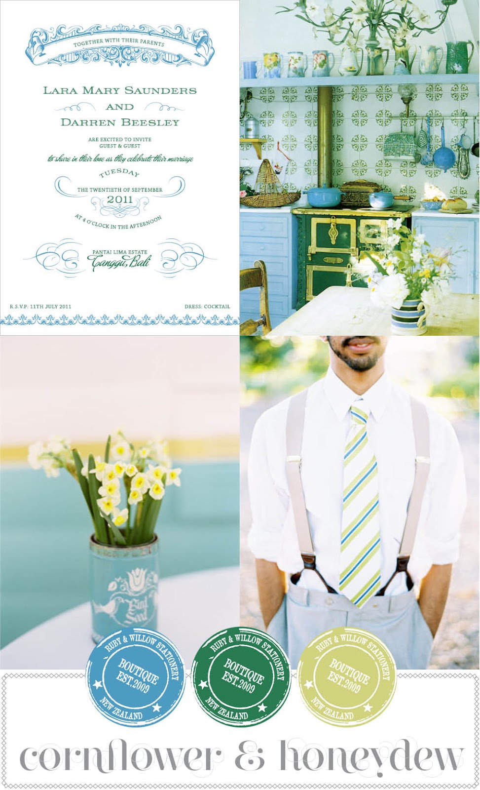
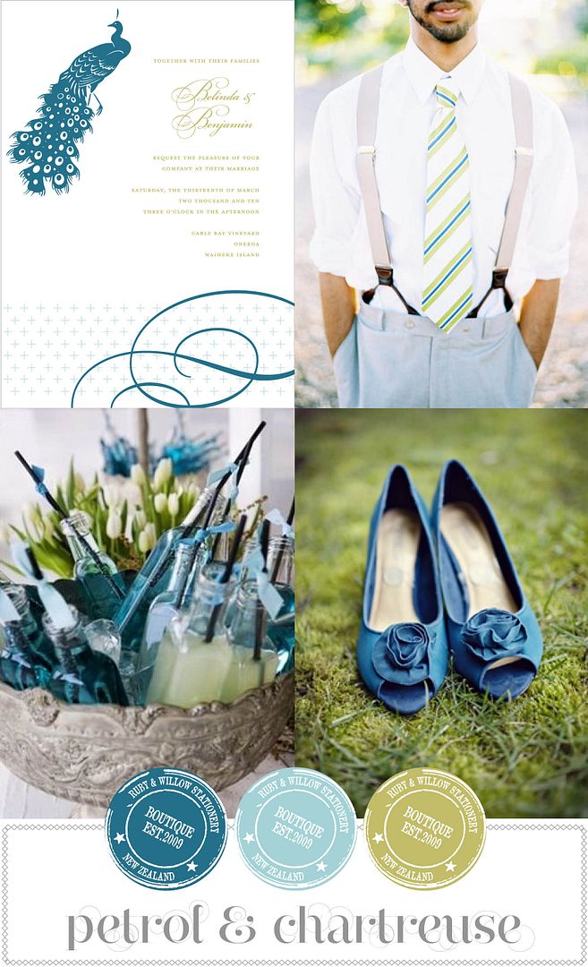
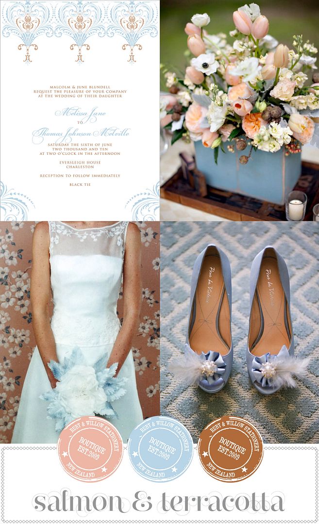
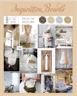
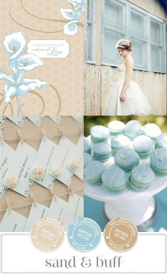
Happy Weekend everyone!! Do you have anything nice planned? We have a dinner with some lovely friends on Saturday night, and a couple of puppy walks I'm sure but the rest of it will be spent charging along with Issue four of {MAG}rouge. I'll leave you with a bit of fresh green and blue colour inspiration, love greens in this combo... hope you have a fabulous weekend!
Showing posts with label Colour Study series. Show all posts
Saturday, August 18, 2012
Saturday, August 4, 2012
Colour Study | Green with Chartreuse & Sienna
Well happy Saturday to you all!! What a fabulous finish to the week we've had here in NZ with 2 gold medals in the rowing late last night. Very exciting!! And on top of that I hit 3000 likers over on facebook and it's been by far the biggest week on the blog ever! I'm overwhelmed at all the positive feedback and support you give me and it's ever so much appreciated!! I hope you have some nice plans for the weekend? We will be laying low and having a quiet one... I'll be trying to catch up for lost work hours during the week due to a puppy who just doesn't want to relax. If you follow me on Instagram (@rubywillow) you will have seen the sad wee thing having just been spayed with a big plastic collar round her neck... which as you can imagine she doesn't much like! So lots of puppy cuddles for us this weekend!
I love the combination of this kelly green with a chartreuse shade... not two shades you'd naturally think to put together, but in my opinion it works. Your thoughts?
To see the rest of the posts in this series click here.
Photos; Tablesettings | Roger Davies via Country Living, Chartreuse Dress | La Dolce Vita via Project Wedding
Friday, July 27, 2012
Colour Study | Green with Tutu & Watermelon
It's been months and months since I posted a Colour Study Series post, so I think I need to start them up again. I've covered red, yellow, orange and blue, so next up is green... which since it's my favourite colour means I could probably pair it umpteen different ways. But for today it's a very pretty girly look with a tutu pink, and a lovely watermelon shade. Have a great Friday everyone! xo
To see the rest of the posts in the series click here.
Invitation: Birdsong
Labels:
Colour Study series,
Green,
invitations,
Pale Pink,
Ruby and Willow
Friday, November 11, 2011
Yellow... the ways I love thee...
11.11.11!!! How many people out there are saying 'I do' today!! I have two clients getting married so a big congrats to them!! The sun is shining, it's going to be a wonderful day! I am finishing off a gorgeous letterpress job today. I have a tonne of jobs from the past few months to share with you, and I tried to get outside yesterday to take some photos as we finally had a sunny day, but what do you know... the wind hampered my efforts!! Soon I'm sure!
Today I have the last two of the yellow colour love boards. I guess they're in somewhat similar tones... but not! (make sense?) Which do you prefer.... the yellow with the green tones, or the blue? Click here to see the first two from earlier in the week and remember you can see all my colour love boards over on the Ruby & Willow facebook page. Have a fabulous Friday folks xo
Oh and a wee reminder if you haven't entered the giveaway for the Stella & Dot earrings, be sure to head over to the {MAG}rouge facebook page and tag the photo to win. Competition closes next Friday.
This is such a fun bold colour palette. Infuse your day with colour by pairing the happiest of yellows with this stunning mint green. I see pinwheels and bunting galore! Invitation: Fantail
Another vibrant look. Makes me think of tropical islands and clear turquoise waters! Invitation: Traveller
Top image: Yellow blouse & flowers | Tinywater, Cake & Bunting | Stephanie Williams, Dress over Green door | Jen Rodriguez
Bottom image: Lemons & Books | Loreta Blog, Car on beach | Thayer Photo, Chair with cushions | Janne Peters
Friday, November 4, 2011
Yellow... the ways I love thee...
Phew it's Friday! I've made good on my promise to get up early every day this week. Either 5.15am or 6.45am - depending on the husband's routine. Most mornings are 5.15am - that's when he leaves the house, not gets up!! Crazy I know! And yep I admit yesterday I really really really wanted to ignore him, feign the deepest of sleeps, then lash out at him for daring to actually flick the lights on to wake me up and literally deposit me in my office chair! But he does have a cup of green tea all ready for me so I can't complain, and I have asked him to do it regardless of my protests. I'm trying out this new routine of going to bed at a reasonable time instead of staying up working all hours. I'm sure I'll be more productive this way. So far it's working!! Even if I did sneak in a 30 min nap later in the day :-) And today... Friday, I plan on shutting the computer off around 1ish to spend the afternoon hanging with a friend who's up in Auckland for the day! Yay!
Today I have a couple more of my yellow colour love boards. Click here to see the first two from earlier in the week.
Whilst I know purple and yellow is never going to be everyone's cup of tea, done in the right way it can be such a striking combination. I don't personally like it too bold, I prefer it with a softer smoky lilac or lavender as well as a more intense purple. Invitation: as yet unnamed!!
Another more autumnal palette. I have a bit of a love affair going on with anything terracotta right now and mixed with a mustard yellow it's perfection. So warm and inviting! Invitation: as yet unnamed!!
Top image: Gingham covered favours | Amy Carroll via Once Wed, Flowers | via Wedding Style Guide, Vines on wall | Greg Hefner
Bottom image: Dessert Table | Belathee via Style Me Pretty, Cider | via Eat, Drink, Pretty, Men's suit and tie | Cana Video via Wedding Chicks
Wednesday, November 2, 2011
Yellow... the ways I love thee...
Good morning, how's your week going? I've been making my husband get me up at the ungodly hour he arises most days in order to get a head start on the day. And as I'm not a morning person and will complain and fight it as much as I can, I've told him to literally deposit me in my office before he leaves for work (at 5.15am!!!)... I'm only two days in to this new routine so it's anyone's guess as to how long it lasts!!
It's been a while since I've shared my colour love series with you. It started some time back with red... since it's my least favourite colour to use in weddings, showcasing the ways in which I did indeed like it. Now yellow I have no issue with... I pretty much LOVE it any which way, so this showcases just a few options, and I'll have some more for you in a couple of days.
I definitely wouldn't love this so much if it were all pastel shades, but the pop of fuchsia really makes it for me! It's utterly feminine and elegant and simply too pretty for words don't you think? I'm in love with this soft buttery yellow. Invitation: as yet unnamed!!
So this isn't a pure yellow, it's more of a citron shade, but I'm counting it as yellow! I love it paired with all types of green and you see yellow with a kelly green a lot but not so much this gorgeous earth olive shade. Really pegs back the shape citron. Invitation: as yet unnamed!!
So what do you think? Do you sway more towards the pretty feminine yellow with shades of pink, or the more rustic earthy appeal of taupe and olive?
Top image: Bride in yellow dress | Brumley & Wells via Wedding Chicks, Table setting via Style Me Pretty
Bottom image: Cake | unknown, Dress | Kate MacPherson, Tablesetting | Souder Photography via Style Me Pretty
Wednesday, May 11, 2011
Orange... the ways I love thee...
Well Blogger issues put paid to any ideas I had of getting a post up yesterday so an enforced break was had!! Continuing today with my colour study series... to see the first part of the Orange study from last week click here. Do you have a favourite out of these two?

This is such a pretty colour combination, using blues/greens from teal to seafoam to barely there aqua, and warming it up with lovely peaches and apricots. Perfect for a springtime soiree! Invitation: Wintergarden
Photo credits; Bride & Groom | Amy Major via Style Me Pretty, Jam Favour | Once Wed, Books | Josh Goleman
Tangerine & Candy pink... such a fun combination. You know you're in for a party if you get an invite in these colours!! You can go all out with the florals in this fun summery look. Invitation: SalzburgPhoto credits; Bouquet | Jose Villa, Sorbet | Cannelle Vanille, Centrepiece | Rebecca Wood via Style Me Pretty
Friday, May 6, 2011
Orange... the ways I love thee...
It's been a while since I did my 'colour study' series. It started off with red since it's a colour I struggle with a lot of the time (although oddly I am attracted to it for home furnishings right now... in a rustic, ticking cloth, burlap kinda way :-), and I was showing the ways in which I do like it. So I'm moving onto Orange today... a colour I do like but you don't actually see used all that often in weddings. To see the previous posts click here for red, and here and here for blue.
This is probably one of my favourite ways to use orange, in a burnt shade with rustic elements, mixing it up with warm ochres, and browns... obviously quite an autumnal colour scheme. Burlap would be a must have!!
Invitation: Aspen
Invitation: Aspen
Photo credits; Cake | Belathee, Gourds on fence | Martha Stewart Weddings
An unexpected but super pretty combination. You often see colours like these in more exotic weddings... especially Indian weddings, but I think it works perfectly for a softer romantic look as well, with the deeper beet anchoring it. Invitation: Mayfair Photo credits; Soup | Kirsten Strecker, Bride in Lavender Dress | Jenny Sun via Green Wedding Shoes, Bouquet | Image is Found via Style Me Pretty
Another favourite, mixing up soft apricot shades with earthy olives and warm taupes. You don't often see men wearing suits in this shade but for the right wedding I think it looks fab. And the flower options are endless with this combo. Invitation: Oiseau Photo credits; Bouquet | Style Me Pretty, Suit & Tie | The Knot, Bouquet | Cocktails | Jose Villa
Check back in next week for my final two orange boards.
Tuesday, October 19, 2010
Blue... a few more ways I love thee...
A continuation from my post on Friday with ways I like to see blue incorporated into a wedding. And a bit of housekeeping re the new blog... if you want to see all the inspiration boards in the one place, you can just click that little image over there on the right and you'll have all the boards at once! And don't forget you can also click through the gallery on our Facebook page, or see them all as thumbnails which is a great way to pick and choose.
Blue with Chartreuse green. This has always, always been one of my favourite colour combinations - in fact one of the earliest rounds of my logo was in these colours. It's so crisp and fresh, and perfect for a wedding where you don't necessarily want to be overly pretty and girly (or if you have a certain someone giving you the thumbs down about pink!). Invitation: Plume
Blue with Terracotta. This colour combination isn't one you see a lot, but it's ever so pretty. Add in a softer salmon or dusky pink and it's a sure fire winner. Perfect for either garden wedding or ballroom soiree.
Friday, October 15, 2010
Blue... the ways I love thee...
I had so much fun putting together this fun little post about the ways I like red in a wedding, I thought I'd start to work my way through other colours. Starting with blue.... again not one of my favourite colours in it's true bluest form. I love a smoky duckegg blue, or a teal blue, or a navy but it's just not my go to colour. For the purposes of this exercise I've steered clear of a more teal blue and just stuck to a regular shade (if there is such a thing). There's two more to come but I'm saving them for next week!
If you want to see how I like red click here.
Blue with wisteria. So utterly pretty and feminine. Perfect for a kitchen tea or shower. Bring in Navy and Plum to give it depth, use lots of vintage china, toile fabric, lush garden roses and you're onto a sure thing. Invitation: Etoile.
Blue with a sunshiny, lemony yellow. An instant mood lifter. I definitely see this being used for a more casual outdoor wedding, lots of fresh fruit, picnic boxes, seersucker suits, vibrant modern design touches. Or a nautical theme... these colours lend themselves perfectly for that. Invitation: Arboretum.
Blue with warm sandy tones. Truly delectable!! I feel peaceful just looking at it. Suited for a classic, refined soiree. Elegant, but with room to inject some vintage touches. It lends a very soft, dreamy appeal. Could also be used for a informal beach wedding. Invitation: Amour.
Tuesday, August 10, 2010
Red... the ways I love thee...
Yesterday I mentioned I had a love/hate relationship with red. Whilst it certainly isn't my go-to colour, sometimes I think it's totally fabulous! So just for fun I've put together a few vignettes of how I DO like red, and naturally I had to pair each one up with an invitation from the Signature Collection. Now looking at these I may have to reassess my stance on red... perhaps having come with all these options I do like it after all. As long as it's on my own terms :-) What would you pair it with?
Love it with this chartreuse green, it's very funky and contemporary. And I like the industrial edge that the grey/charcoal lends it. I see quite a modern wedding in this colour scheme in an urban setting. Invitation: Letteria.
Ahh blue and red... could conjur up very patriotic red, white and blue images but not so with a softer rhubarb red paired with a pale blue, or a lovely turquoise. So so pretty! Invitation: Dauphine.
This is quite possibly my favourite; mixing the vibrance and strength of red with the earthy tones (did I hear a rustic in there?). Throw in some red ticking cloth and I'm all over it. Invitation: Dogwood.
How utterly divine does the red look with this apricot!! I think this combination oozes femininity - could be a struggle getting the Mr to go with it however! Invitation: Charleston.
And lastly, I'm pushing the boundaries of red per-say, it's more of a warm brick/terracotta shade but it's close. And it's so inviting with these autumnal tones. Invitation: Grove.
And there we have it, my little study of red!! Have a great day!
Subscribe to:
Posts (Atom)