
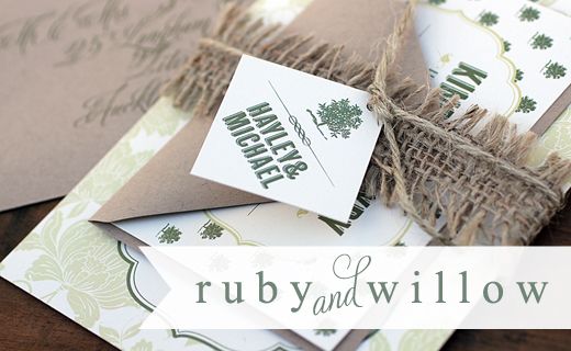
I can't even tell you how long I stared at my screen for in order to come up with a creative name for this board... and failed miserably!! But in a way that kinda works as the whole point of it was to create a somewhat timeless look that didn't fit into any boxes. You wouldn't look at these images collectively and instantly name a colour theme, yet they all work cohesively together. I think couples often get too caught up on ensuring everything matches, but it can just take the tinest touch of colour here and there. to bring your look together. You also wouldn't look at this and pigeon hole it as being vintage or retro or ultra modern... it's kinda just about the couple being who they are, loving what they love without having to put a name to it and I think if you do that, it will stand the test of time.
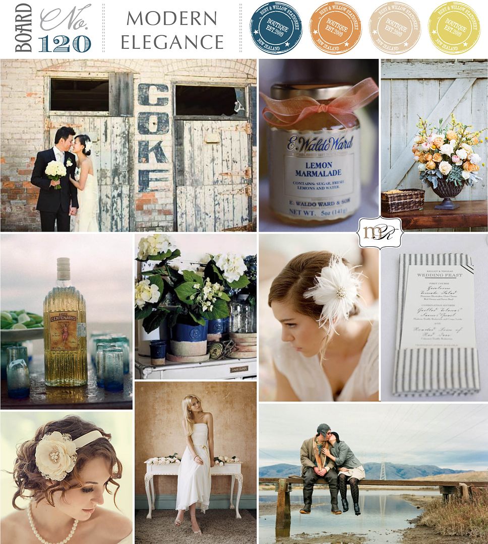
Photos from top left; Couple | Adrian Tuazon via Polka Dot Bride, Favour Jar | Elizabeth Messina, Centrepiece | Braedon Flynn via Southern Weddings
2nd row; Tequila bottle | unknown source, Flowers | Pottery Barn, Hairpiece | Lo Boheme, Menu | via Snippet & Ink
3rd row; Bride | via Brides.com, Bride | Jim Helm, Couple | Tanja Lippert


12 comments:
Loving this color palette...it's unique with earthy tones and yet splashes of color everywhere!
So great how you explained that it's not about perfectly matching colors, but about creating the wedding look & feel that truly captures what the couple is about! You did find lovely images for this board, though!
Love this board. Its sophisticated without being too stuffy. Great colors!
Absolutely LOVE this board-can't wait to see what gorgeous suite comes from this puppy!
I think your board's name is just right: it has got a timeless yet modern elegance to it... Love it.
I totally agree with you. Too many people want the match-match wedding. I love all the elements you combined together here. They flow without being a "theme". Does that make sense? This is an amazing board and post! Thanks Kate! Have a great week.
love this board as it reminds me of that cool rustic bourbon feel with a little glam!
Oh I adore this! It's the perfect touch of urban and rustic. So beautiful :)
I love the board but mostly your point about being pigeon holed! Getting stuck on a very specific color palette can stifle so much creativity! Fabulous point!
something this gorgeous doesn't need a fancy name - the beautiful collage of images speaks for itself! lovely!
a pretty palette, indeed. So much to love about this. xoxo, chrissy.
Well I think the name of the board is perfect! And it's so refreshing to not have a specific theme per se...it allows you to create or make it out to be whatever you want! I love the depth the darker blue adds to the board. Gorgeous board...and that flower arrangement is gorgeous too!
xoxo
kristi
Post a Comment