
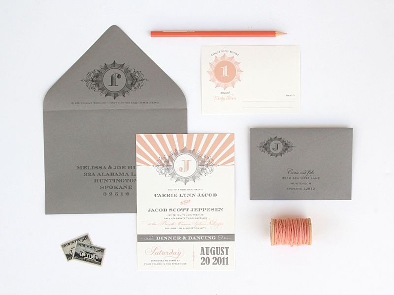
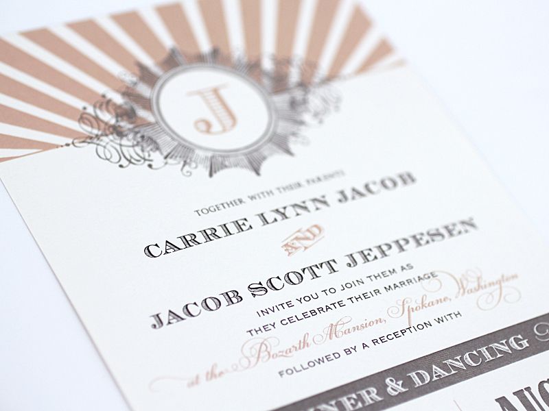
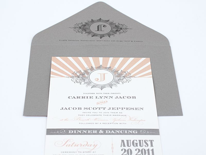
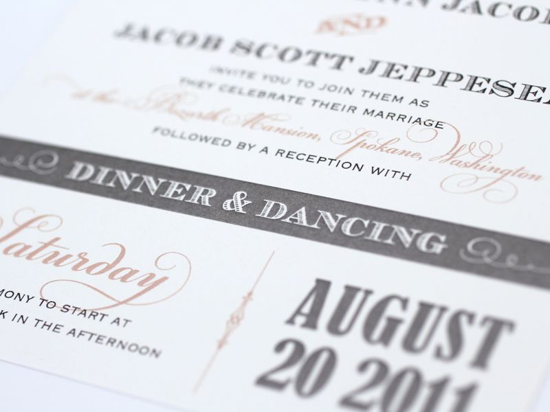
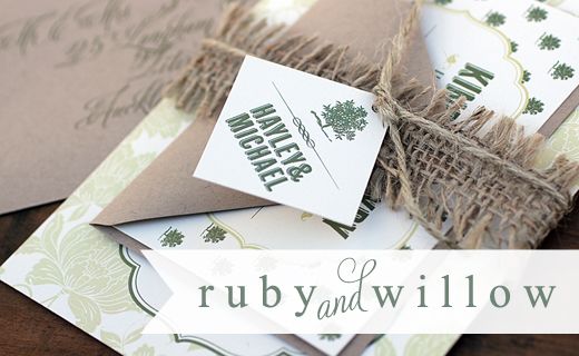
I think peach has been the main colour story of the past 6-12 months, from muted apricot shades like Carrie & Jacob's invitation here, to more coral shades, it's been super popular. And combined with either a grey or a mink brown seems to be the common pairing. You may have previously seen this invite in a chartreuse green but isn't it super pretty in this colour way printed on Ivory?


15 comments:
You know I love just about any soft shade paired with grey! Okay, I take that back...I love anything paired with grey ;-))) I love the color grey...and thing it can be pretty spectacular...as shown her with the prettiest shade of peach! Kate the details here are just faublous! I love the monogram inside the design...and in the top left corner of the RSVP envelope!!! Another amazing job my friend!
xoxo
kristi
The color scheme is perfect!!! Love soft shades in invitations suites!!
Its amazing how a different color palette can completely change the feel of the invitation. LOVELY!
LOVE the colours. Brilliant Kate!
These are gorgeous! Love the color combo. One of my faves!
LOVE THESE!! The colors are perfect, and I love the mix of modern lines and colors with the vintage type. Gorgeous! Xo, Katie
Pretty unusual for me but yet, I do love it. I like Orange though... (or peach) and I think it's one of 2011's colours!
You FLOORED ME with this-this suite is stunning!
Peach and grey will always have my heart. Beautiful!
so gorgeous! love this stationery. and your entire blog. hope ull check mine out!
xoxo
kat
http://withlovefromkat.blogspot.com
SO beautiful, Kate! LOVE it.
I'm absolutely OBSESSED with these invitations!! The slate grey is stunning.
Just curious if these were printed offset or by another method?
how did i never notice how BEYOND AMAZING that envelope is?! (so not surprised with your fantastic talent!) xo
Post a Comment