
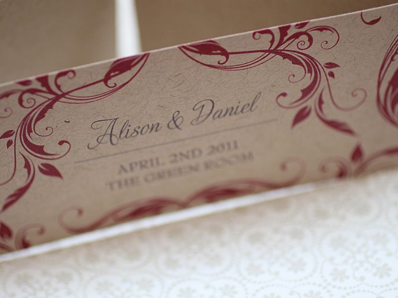
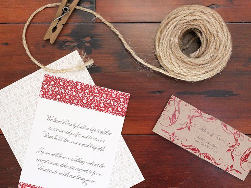
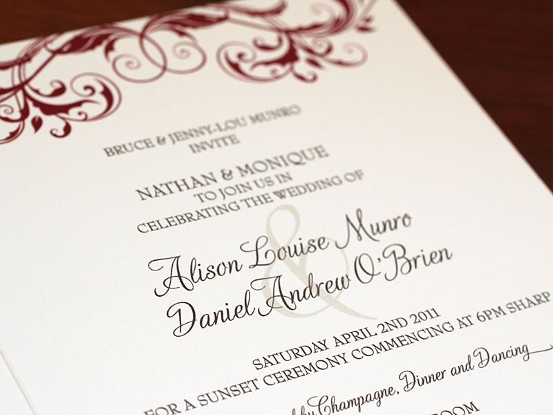
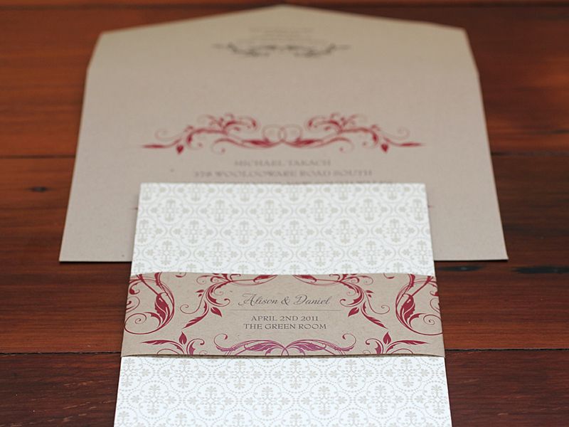
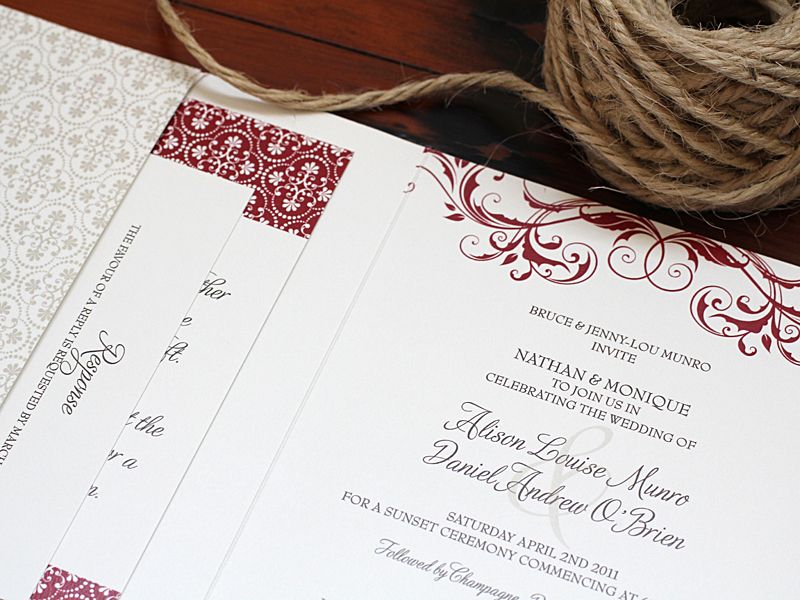
Now if you've been reading the blog for a while you'll probably know that I'm not the hugest fan of red, however there are certain ways I love it (as in this post I did on the very subject) - and this is certainly one of them. Used with a taupe or natural colour it softens the red and makes it much more agreeable to me!! Congratulations to Alison & Daniel who got married a few weeks ago!


10 comments:
You're so right - the neutral really calms the red down. These are beautiful!
Just BEAUTIFUL designs.
hello, beautiful. loving these designs of cranberry red + taupe. Such a classic palette. Your invitations are truly stunning. xoxo, Chrissy.
You did a beautiful job. I agree I can do red on my shoe and handbags, but I can hardly wear it. This combination is lovely.
I am also not the biggest fan of red, but this is the perfect dose muted by a subtle, soothing color. Gorgeous work!
Love it! I like red. Not too much red but here it's just lovely!
I love the kraft and red-how lovely!
Beautiful design! The colors work together in a perfect way!
How lucky are Alison & Daniel to have a R&W suite. I love the brown & red together. ps I love the filigree on the envelope....so pretty
Well I am sure you know I feel the same way about red ;-))) However, the taupe calms does calm it, and on these invitations it is perfection!!! So gorgeous Kate!
xoxo
kristi
Post a Comment